IBM Traveler Central
- Who it's forIBM employees
- Team4 Mobile Engineers, 1 Product Manager, 1 Data Scientist, 1 Sociologist
- RoleProduct Design Lead
- EmployerIBM Research / IBM Services
The Problem
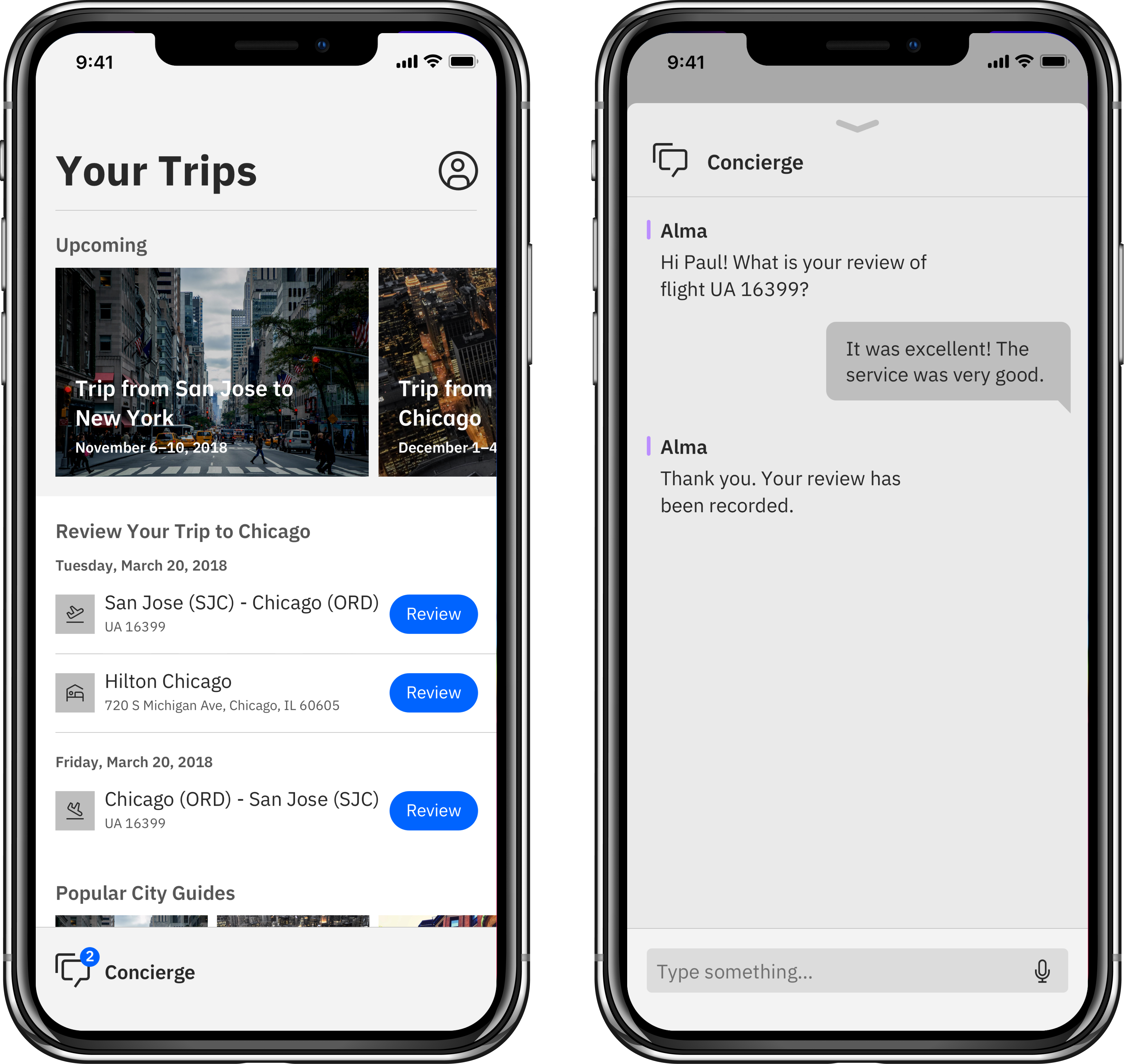
Business travel, especially within an enterprise like IBM, is messy, nebulous and difficult to manage. From a user-centered standpoint, employees often find themselves juggling multiple parts of a trip at every touchpoint—from managing trip itineraries from airline, hotel and rental car companies to prepping for actual meetings to finding an impressive restaurant to entertain clients after a meeting. The stress factor of business travel increases when considering the number of software apps an employee must access to get all the information needed. Oftentimes, employees use both internal apps for corporate policy information while simultaneously relying on 3rd party apps for flight and hotel check-ins as well as restaurant recommendations.
In a study conducted by IBM’s HR and Global Procurement departments, the findings highlighted that employees feel friction during every leg of their journey. To make matters more challenging, these pain points translated into infrastructure inefficiencies—employees weren’t taking advantage of the benefits and programs stakeholders have worked hard to set in place from vendors like airlines and hotel chains. Recognizing that business travel is critical to IBM and serves as the cornerstone of a corporate travel program, HR and Procurement sought to engage our team at IBM Research to help them improve on policy, sourcing and innovation in this space. Through workshops conducted in 2016, the idea of IBM Traveler Central, a mobile application, emerged as a way to provide IBM employees with an innovative, friction-free travel experience.
Process & solution
Due to the complexity and breadth of this solution, my team and I used IBM Design Thinking to understand the needs and wants of our employees. We began by interviewing a variety of IBM employees who travel for business—from the veteran road warriors taking multiple trips per month to the beginning consultant traveling once per year. Through these interviews, we were able to devise two personas, Yin and Stacey, who capture the essence of both sides. We also selected a few sponsor users who would help ensure that our design process aligned to their needs.
After checking in with our sponsor users and stakeholders, we kicked off a few ideation workshops. We crafted empathy maps to help us understand as-is states and then brainstormed innovation ideas with big vignettes, later translating those ideas on a prioritization plot. From these workshops, we were able to determine the desired outcomes we strived to achieve for our users and the end result. We decided to approach IBM Traveler Central first as a mobile application and then as a standalone web application. These outcomes ultimately drove the design sprints we planned in tandem with Agile development sprints.
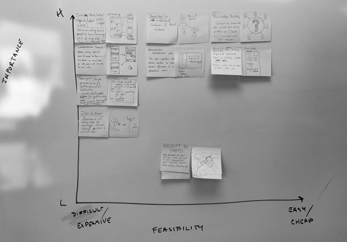
In effect, every sprint led us closer to a working prototype that addressed the most fundamental business travel needs. Knowing that users want to feel less overwhelmed by business travel and simultaneously want it to be something they look forward to, we sought to use design and analytics to highlight the most important aspects of a trip and provide tailored recommendations while at a new destination. We used biweekly check-ins with our broader team to help us achieve these goals.
Outcome & next steps
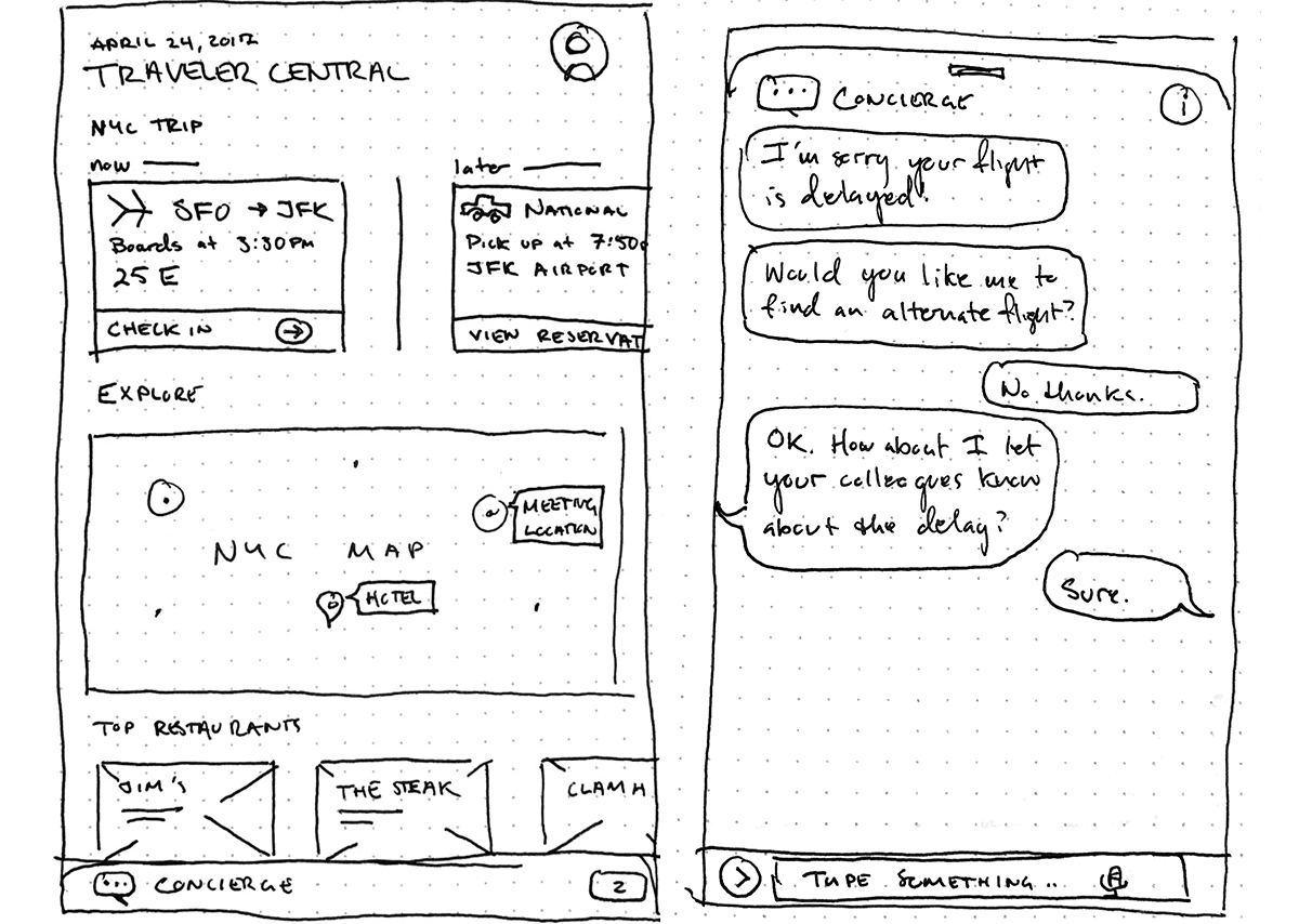
Juggling the variety of user travel scenarios meant designing an experience that would adapt to every user. If successful, this would enable each user to focus only on the most pertinent aspects of a trip. While ideal in theory, designing such an experience was by no means a trivial task.
From an upfront Design Thinking standpoint, we had to exhaust all of the potential travel scenarios with end users. By synthesizing common themes, we were able to devise the outcomes we sought: easy access to trip information, personalized recommendations (gyms, restaurants, attractions) as well as up-to-date policy and legal information in human-readable formats.
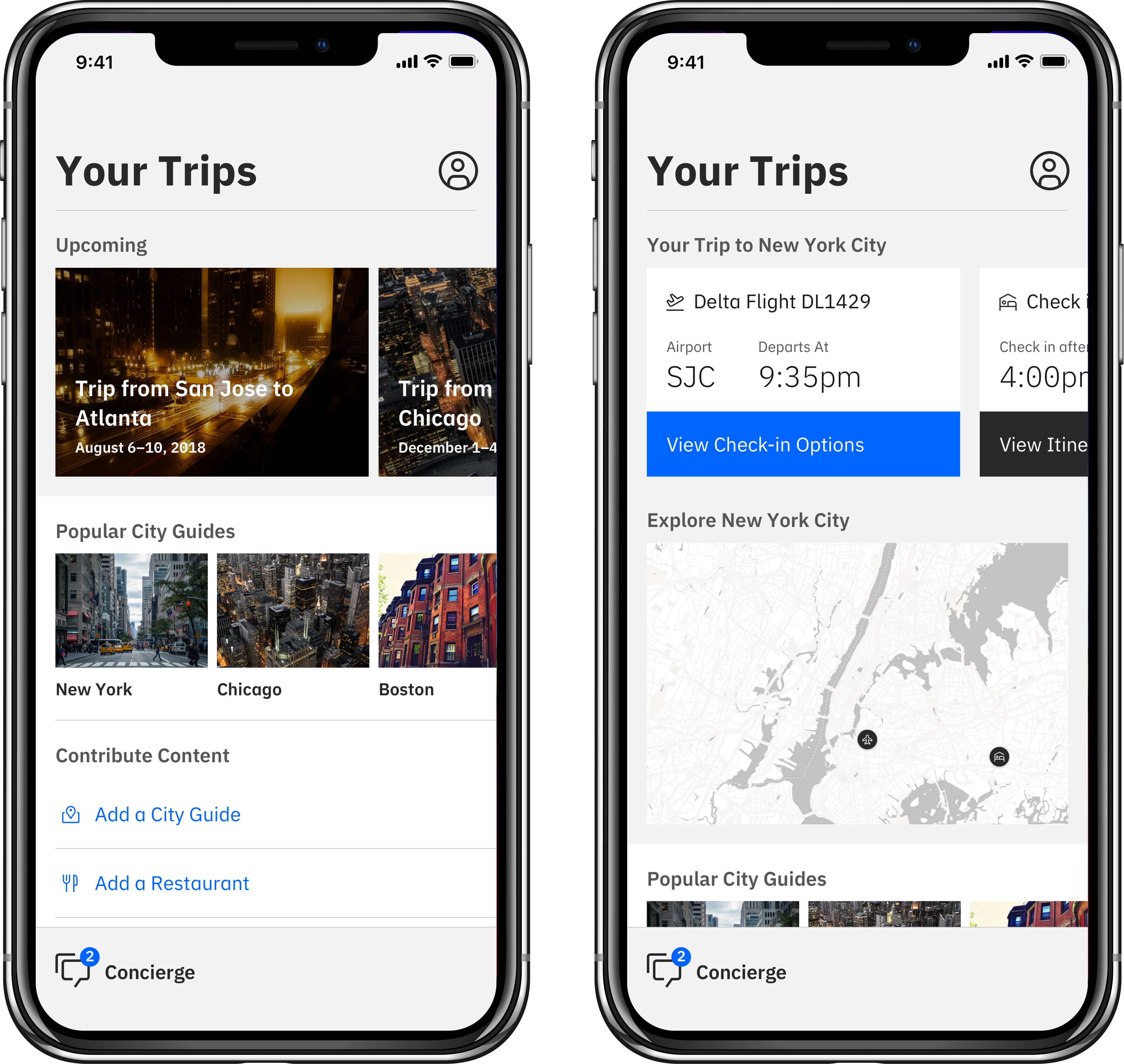
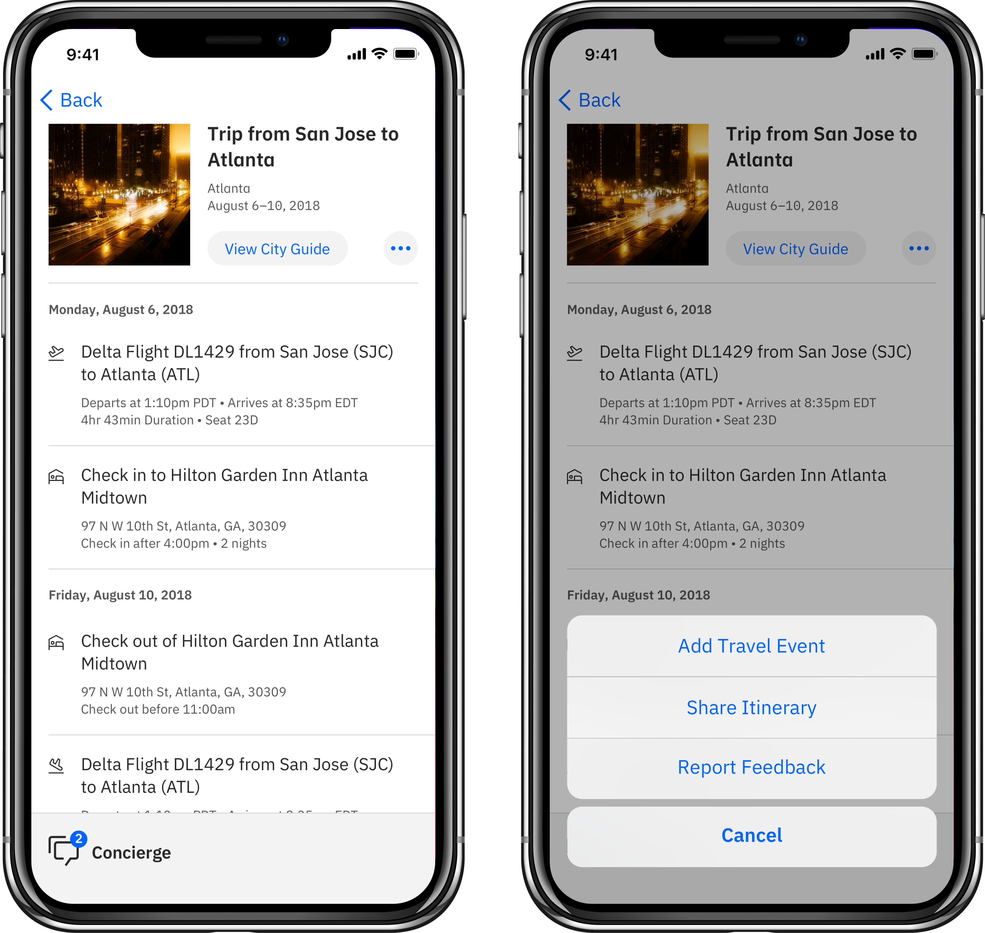
All of these intersections meant managing touch points with multiple parties on the project: end users, data scientists, software engineers and legal entities. Wearing multiple hats became the norm on this project, so organization and time management evolved as design skills in and of themselves.
The prototype was ultimately sunset in late 2018, largely due to the overhead of maintaining content. We learned the hard way of the cold-start problem in data-driven apps, and unfortunately our team wasn’t large enough to manage the overhead. That said, we learned a lot from this project!